Question Types
text
Use for questions that require a text response. It can also be used with the numbers appearance to get integer responses that are longer than the 9 character limit of the integer type.
- Type
text
Parameters:
rows: Set the number of rows of text shown in the form
Appearances:
numbers: Shows the numeric keyboard
thousands-sep: Inserts a separator between thousands when "numbers" is also used
url: Allows the user to open a URL. Specify the URL in the default column
hidden: Hide the widget in FieldTask
Availability:
FieldTask: yes
Web Forms: yes
Example
type |
name |
label |
parameters |
|---|---|---|---|
text |
comment |
Any comments? |
rows=5 |
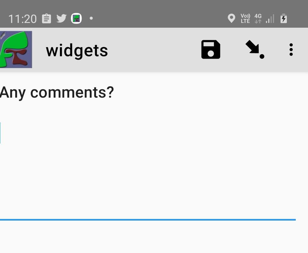
Text widget in fieldTask with 5 rows
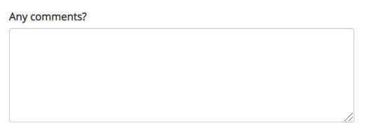
Text widget in Web Forms with 5 rows
Note
There is a limit of 4,000 characters on the amount of text that can be entered into a text question in Web Forms. However there is no corresponding limit in fieldTask.
note
- Type
note
A read-only note to the user.
Notes can be used to provide guidance to the user. This could be simple text that is specified in the survey template. For example:
The following questions are about health
However they can also be dynamically constructed to provide context-sensitive help. To do this use the ${question_name} syntax within the label of the note. The question referred to can be a calculate that creates the text by combining answers from multiple questions.
type |
name |
label |
calculation |
|---|---|---|---|
text |
name |
What is your name? |
|
calculate |
calculate_guidance |
concat('Tell ', ${name}, ' that they are doing well') |
|
note |
guidance |
${calculate_guidance} |
integer
Number questions that do not allow a decimal point and are not longer than 9 digits.
- Type
integer
Appearances:
thousands-sep: Inserts a separator between thousands
hidden: Hide the widget in FieldTask
Availability:
FieldTask: yes
Web Forms: yes
Example
type |
name |
label |
|---|---|---|
integer |
age |
What is your age? |
decimal
Number question with a decimal point. Decimal questions are limited to 14 digits plus the decimal point. You can use a text question with the numbers appearance if you need more.
- Type
decimal
Appearances:
thousands-sep: (Optional) Inserts a separator between thousands
Availability:
FieldTask: yes
Web Forms: yes
Example
type |
name |
label |
|---|---|---|
decimal |
cost |
How much did it cost? |
bearing
A bearing widget captures the compass reading and stores it as a decimal type.
- Type
decimal
Required Appearance:
bearing
Availability:
FieldTask: yes
Webforms: no
Example
type |
name |
label |
appearance |
|---|---|---|---|
decimal |
orientation |
Record the orientation |
bearing |
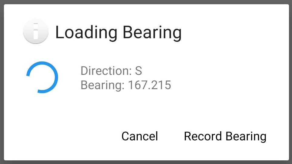
Bearing
barcode
- Type
barcode
Appearances:
front: (Optional) Use the front facing camera
Reads a barcode using the camera.
The following barcode formats are supported:
UPC-A
UPC-E
EAN-8
EAN-13
Code 39
Code 93
Code 128
Codabar
ITF
RSS-14
RSS-Expanded
QR Code
Data Matrix
Aztec (beta)
PDF 417 (beta)
MaxiCode
The flash can be used as a light source when scanning barcodes in a poorly lit environment.
type |
name |
label |
|---|---|---|
barcode |
product |
Scan the products barcode |
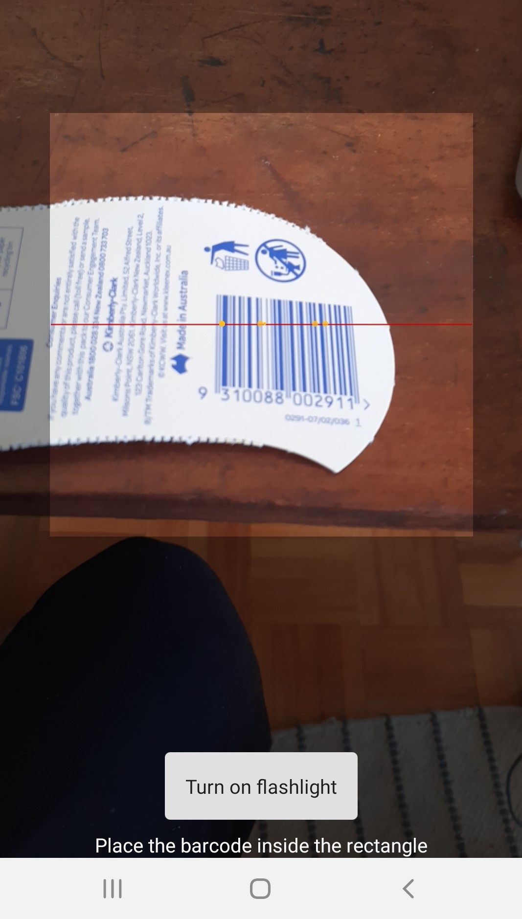
barcode
nfc
- Type
barcode
Required Appearances: * nfc
Availability:
FieldTask: yes
Web Forms: yes
Reads the ID on an NFC chip
type |
name |
label |
appearance |
|---|---|---|---|
barcode |
product |
Scan the products NFC chip |
nfc |
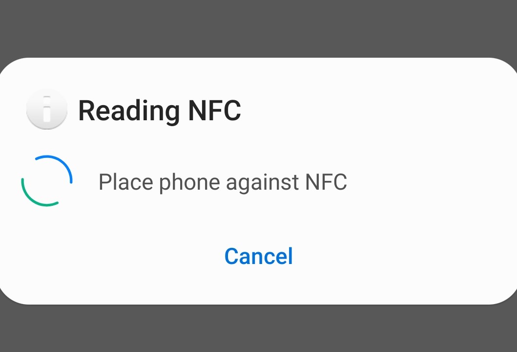
nfc
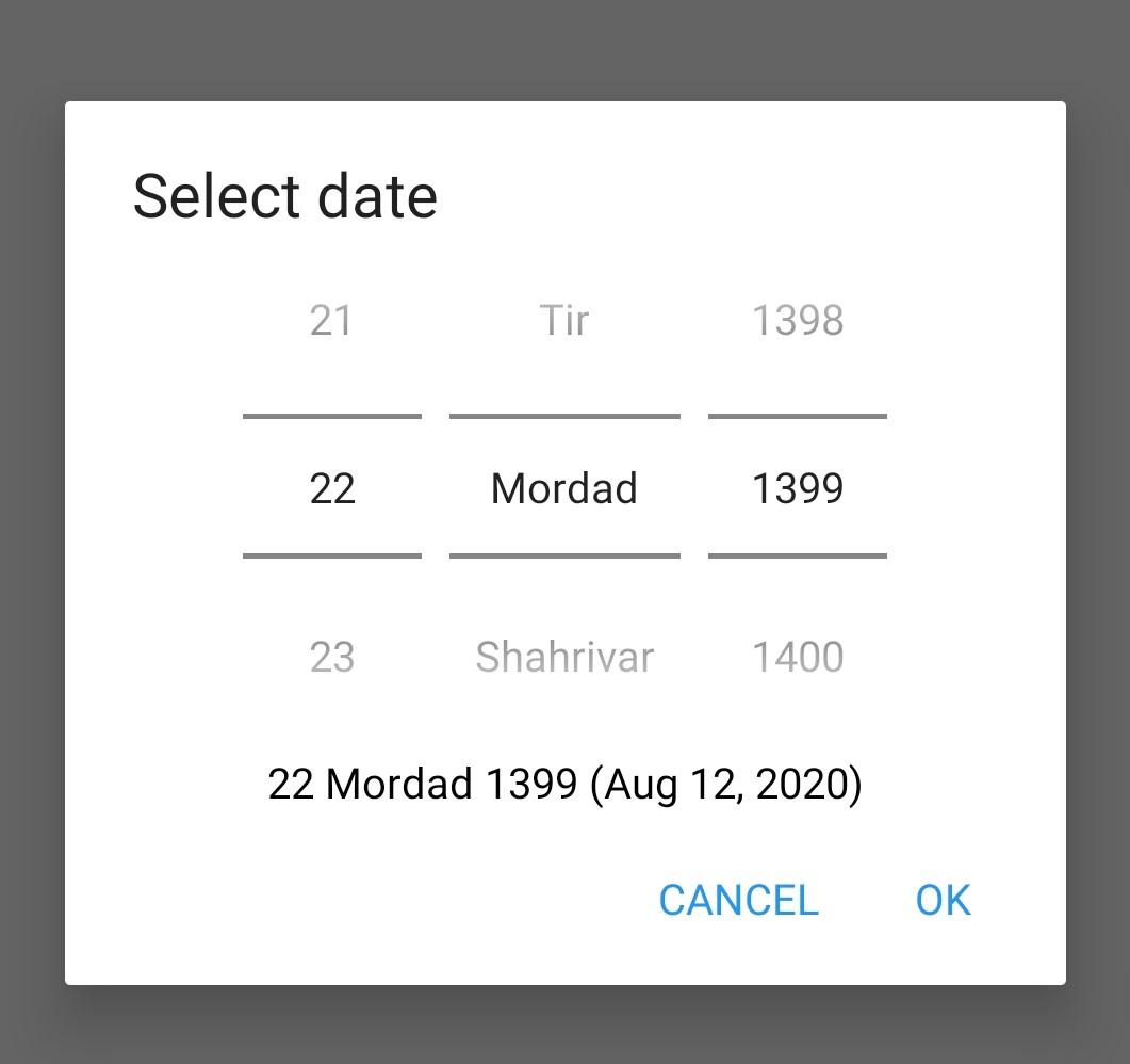
date, time and datetime
default date type
- Type
date
- Availability:
- FieldTask: yes
Web Forms: yes
Example
type |
name |
label |
|---|---|---|
date |
birthdate |
When were you born? |
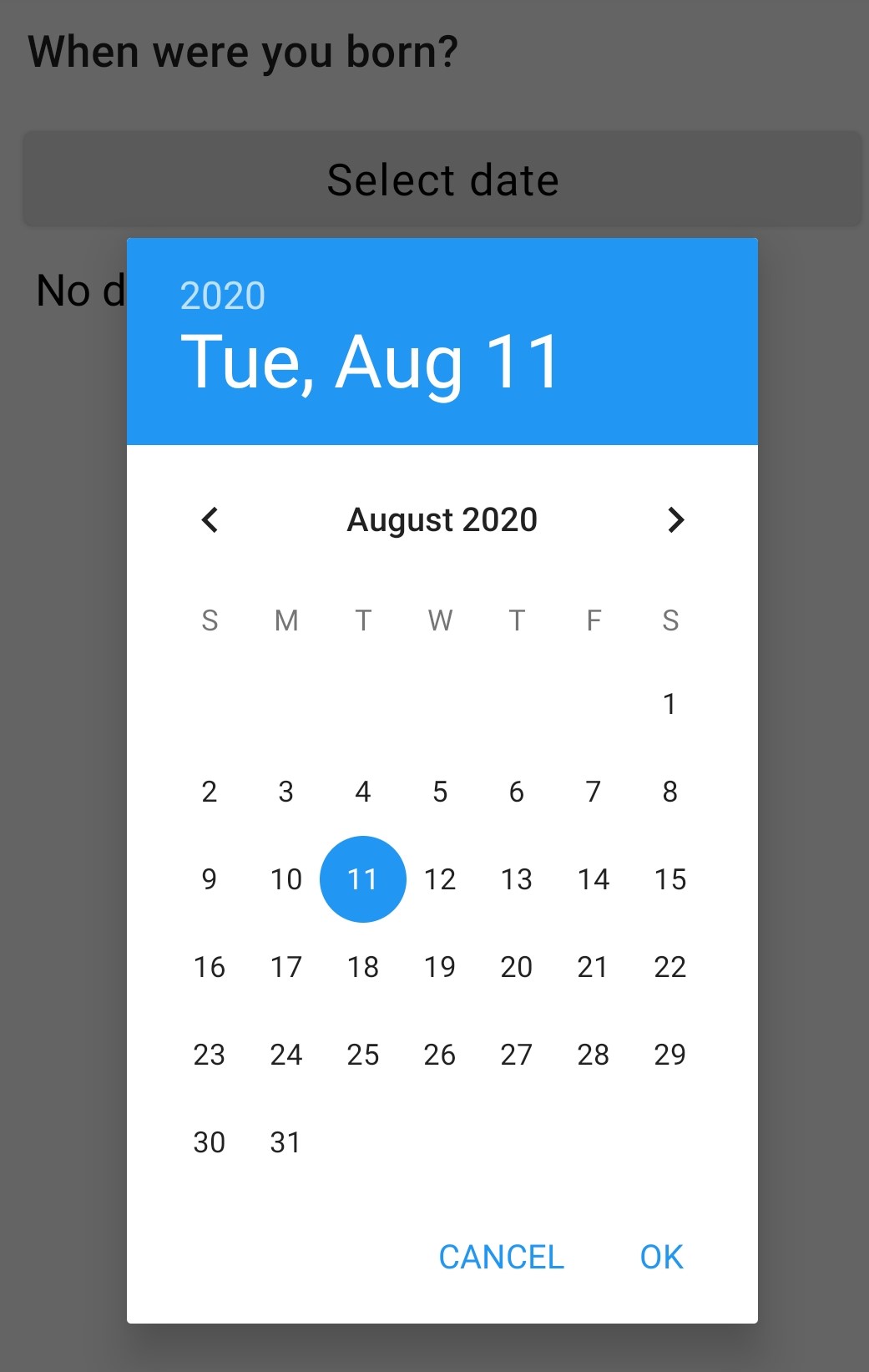
Default date type
date widget with spinner input
A more compact date widget that makes it easy to select dates that are far from the current (or default) date.
- Type
date
- Appearance:
no-calendar
type |
name |
label |
appearance |
|---|---|---|---|
date |
birthdate |
When were you born? |
no-calendar |
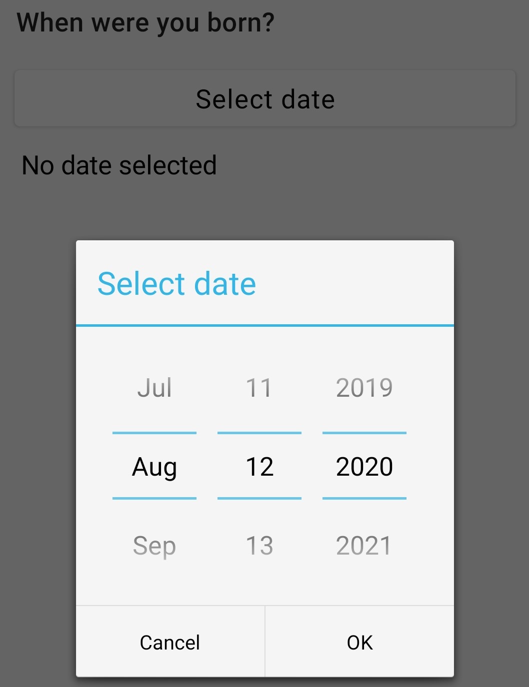
Default date type
month and year only
Only records the month and the year.
- Type
date
- Appearance:
month-year
type |
name |
label |
appearance |
|---|---|---|---|
date |
birth_month |
What month were you born? |
month-year |
year only
Only records the year.
- Type
date
- Appearance:
year
type |
name |
label |
appearance |
|---|---|---|---|
date |
birth_year |
What year were you born? |
year |
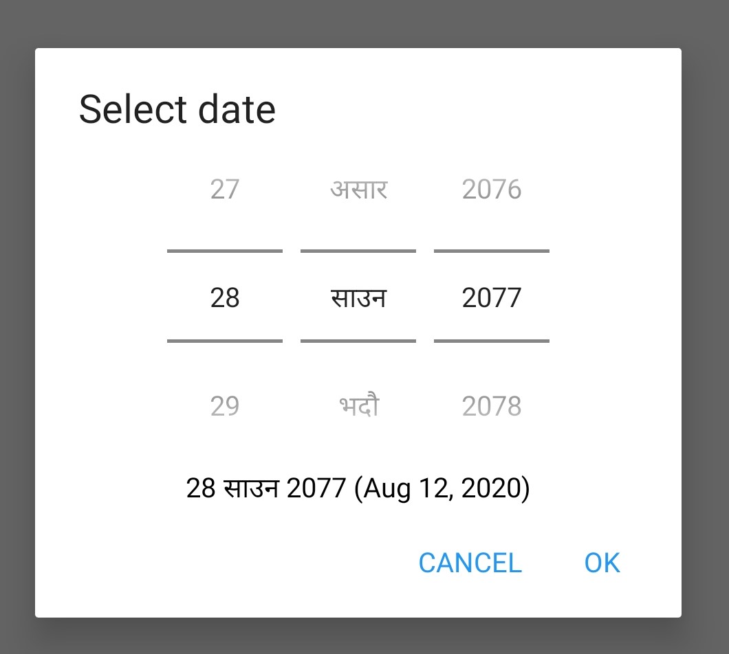
date widgets with non-Gregorian calendars
Note
The non-Gregorian calendar is used only on input. The dates are then converted and stored as standard Gregorian dates
Availability:
FieldTask: yes
Webforms: no
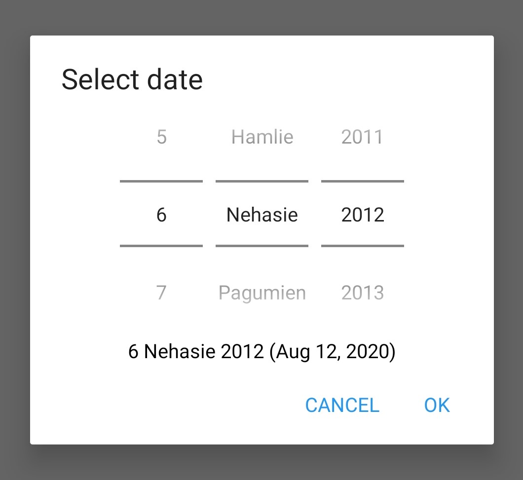
Bikram Sambat calendar
- Type
date
- Appearance:
bikram-sambat
Coptic calendar
- Type
date
- Appearance:
coptic
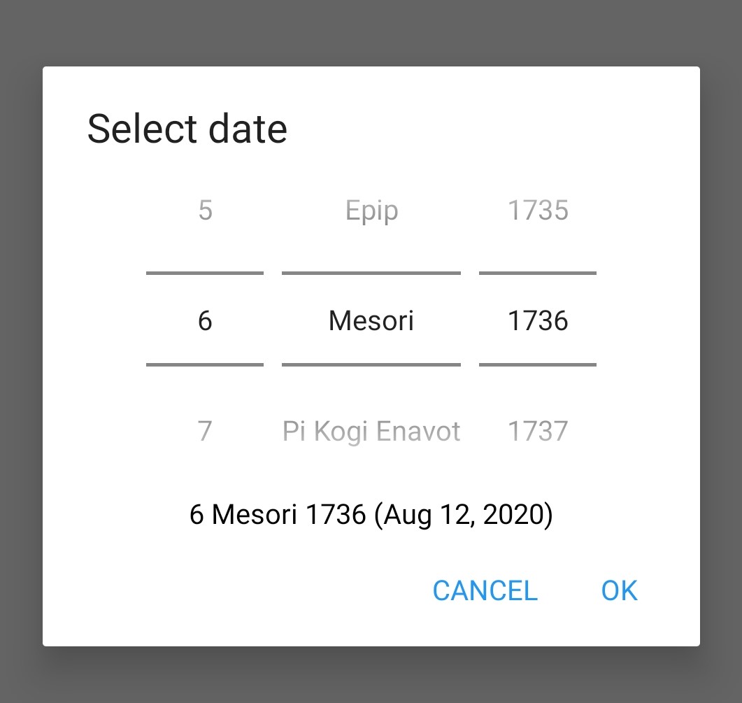
Ethiopian calendar
- Type
date
- Appearance:
ethiopian
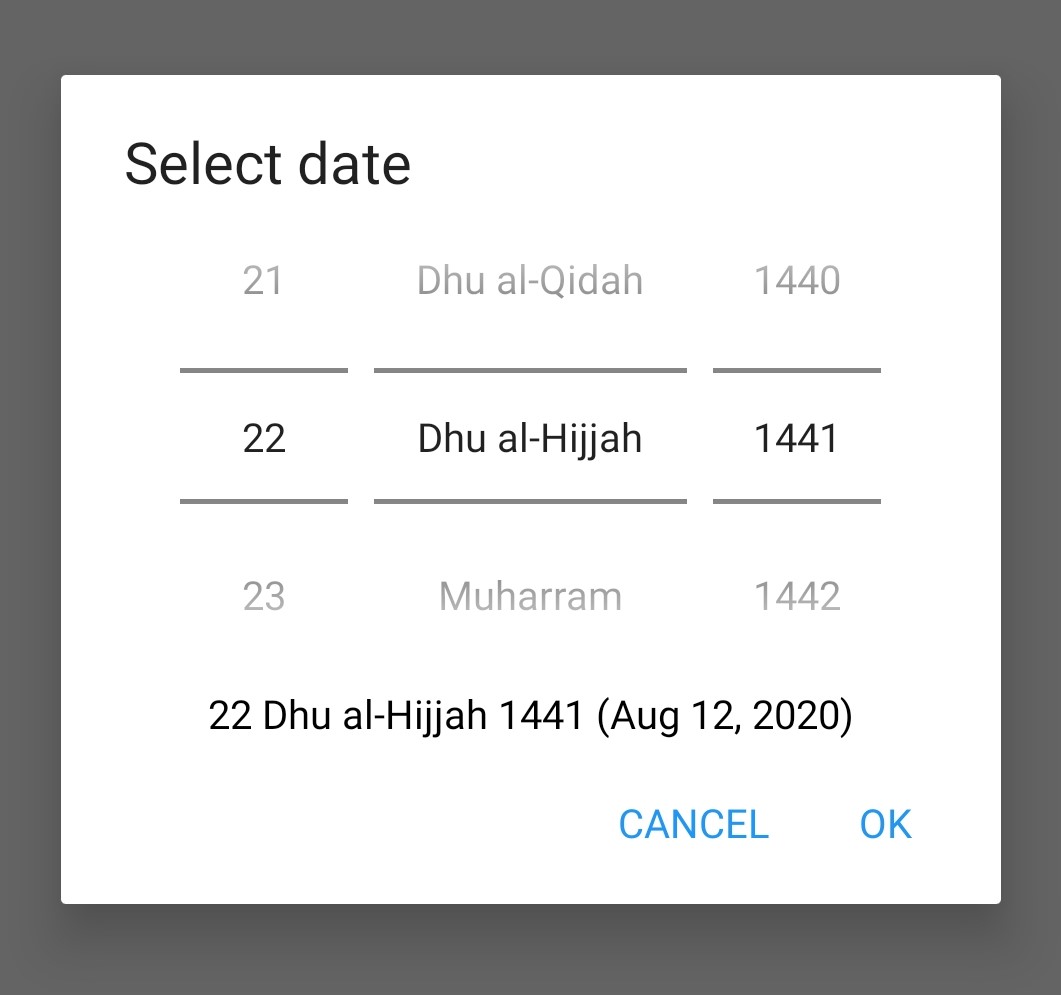
Islamic calendar
- Type
date
- Appearance:
islamic
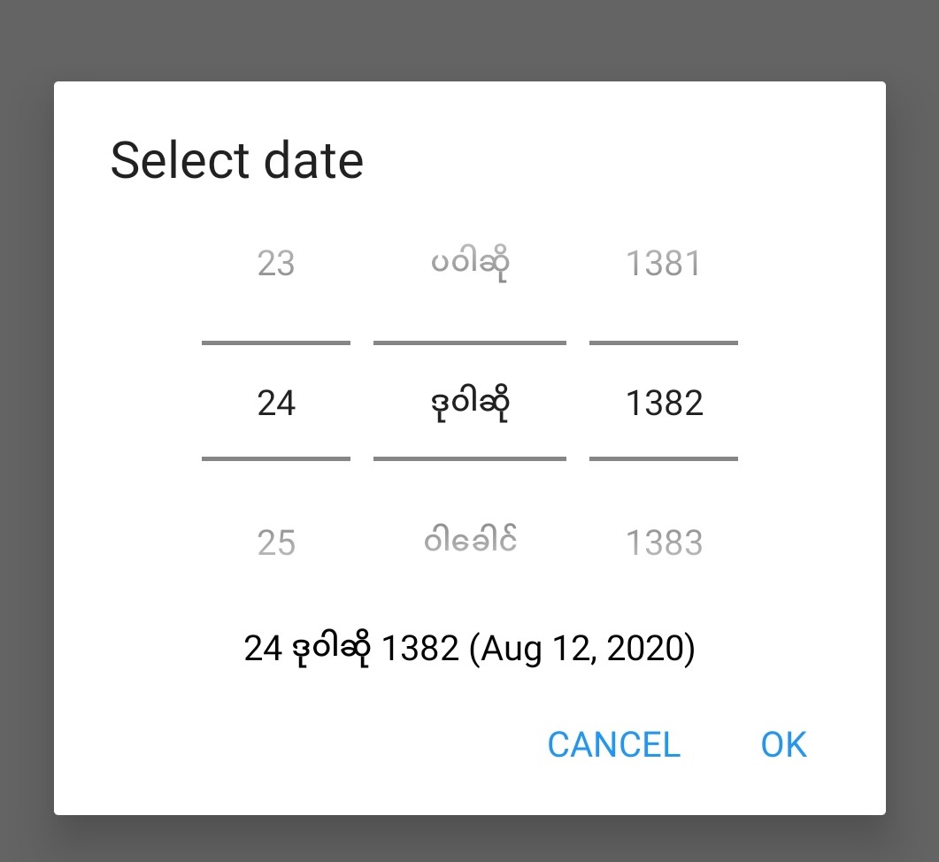
Myanmar calendar
- Type
date
- Appearance:
myanmar
Persian calendar
- Type
date
- Appearance:
persian
time
Records the time of day.
Note
The time is stored along with the time zone. Hence a point in time is recorded. If you record a time of 10:00 am in London then the value is the same as 8 pm in Sydney. If someone in Sydney generates a report using their local time zone then they will see the result as 8 pm.
If you want to record a local time then you can use an integer type or decimal type or a select_one type that has a list of valid times. A question like "What time did the parcel arrive?" could be recorded with or without timezone depending on how you want to analyse the data.
- Type
time
type |
name |
label |
|---|---|---|
time |
arrived |
What time did the parcel arrive? |
datetime
Records the date and time.
- Type
dateTime
- Appearance:
no-calendar: Shows a spinner rather than the full calendar
type |
name |
label |
|---|---|---|
dateTime |
started |
When did you start the project? |
calculate
Specify the calculation in the calculation column. This type is not shown to the user so it does not have a label.
select
Select questions have a type (for select one, select multiple etc) and then in the type column, separated by a space, they have a name that identifies where the choices come from. Choices can be sourced from:
A choice list in the survey
A CSV file or another survey
Data in a subform (begin repeat) in the same survey
single select
- Type
select_one
Appearance:
minimal: Shows a modal dropdown that expands when selected by the user. Useful when showing multiple questions on one page.
autoadvance: Immediately go to the next page after a choice is selected. Only use this appearance if it is immediately obvious to the user that the correct selection was made.
autocomplete: Adds a text box above the choices. If you type into this text box the choices are filtered. Use with large lists.
likert: Show the choices in a Likert scale
compact: Shows the choices in a compact grid. This is particularly useful when you have only images for the choices rather than text labels.
compact-{x}: As per compact, however replace {x} with the number of columns that you want.
quickcompact: Combines compact and auto advance
quickcompact-{x}: Combines compact with columns and auto advance
Parameters:
randomize=true (Randomly sorts the choices each time the question is shown)
seed={an integer} (Use this with randomize so that the same initially random order will be shown each time the question is shown in a given form)
type |
name |
label |
|---|---|---|
select_one countries |
country |
Select a country |
list_name |
name |
label |
|---|---|---|
countries |
mali |
Mali |
countries |
png |
Papua New Guinea |
countries |
australia |
Australia |
countries |
vanuatu |
Vanuatu |
multi select
Allows the user to select multiple answers from a choice list.
- Type
select_multiple
Appearance:
minimal: Shows a modal dropdown that expands when selected by the user. Useful when showing multiple questions on one page.
autocomplete: Adds a text box above the choices. If you type into this text box the choices are filtered. Use with large lists.
compact: Shows the choices in a compact grid. This is particularly useful when you have only images for the choices rather than text labels.
compact-{x}: As per compact, however replace {x} with the number of columns that you want.
Parameters:
randomize=true (Randomly sorts the choices each time the question is shown)
seed={an integer} (Use this with randomize so that the same initially random order will be shown each time the question is shown in a given form)
type |
name |
label |
|---|---|---|
select_multiple countries |
country |
Select some countries |
list_name |
name |
label |
|---|---|---|
countries |
mali |
Mali |
countries |
png |
Papua New Guinea |
countries |
australia |
Australia |
countries |
vanuatu |
Vanuatu |
rank
This widget allows you to rank choices in order.
- Type
rank
Parameters:
randomize=true (Will randomly sort the choices each time the question is shown)
seed={an integer} (Use this with random so that the same initially random order will be shown each time the question is shown in a given form)
type |
name |
label |
|---|---|---|
rank importance |
importance |
Rank the issues in order of importance |
list_name |
name |
label |
|---|---|---|
importance |
food |
Food |
importance |
shelter |
Shelter |
importance |
water |
Water |
importance |
security |
Security |
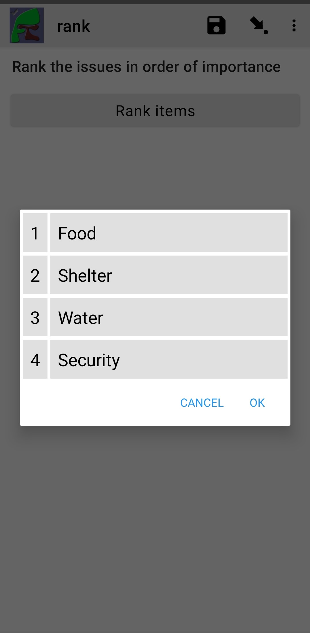
rank widget before re-ordering
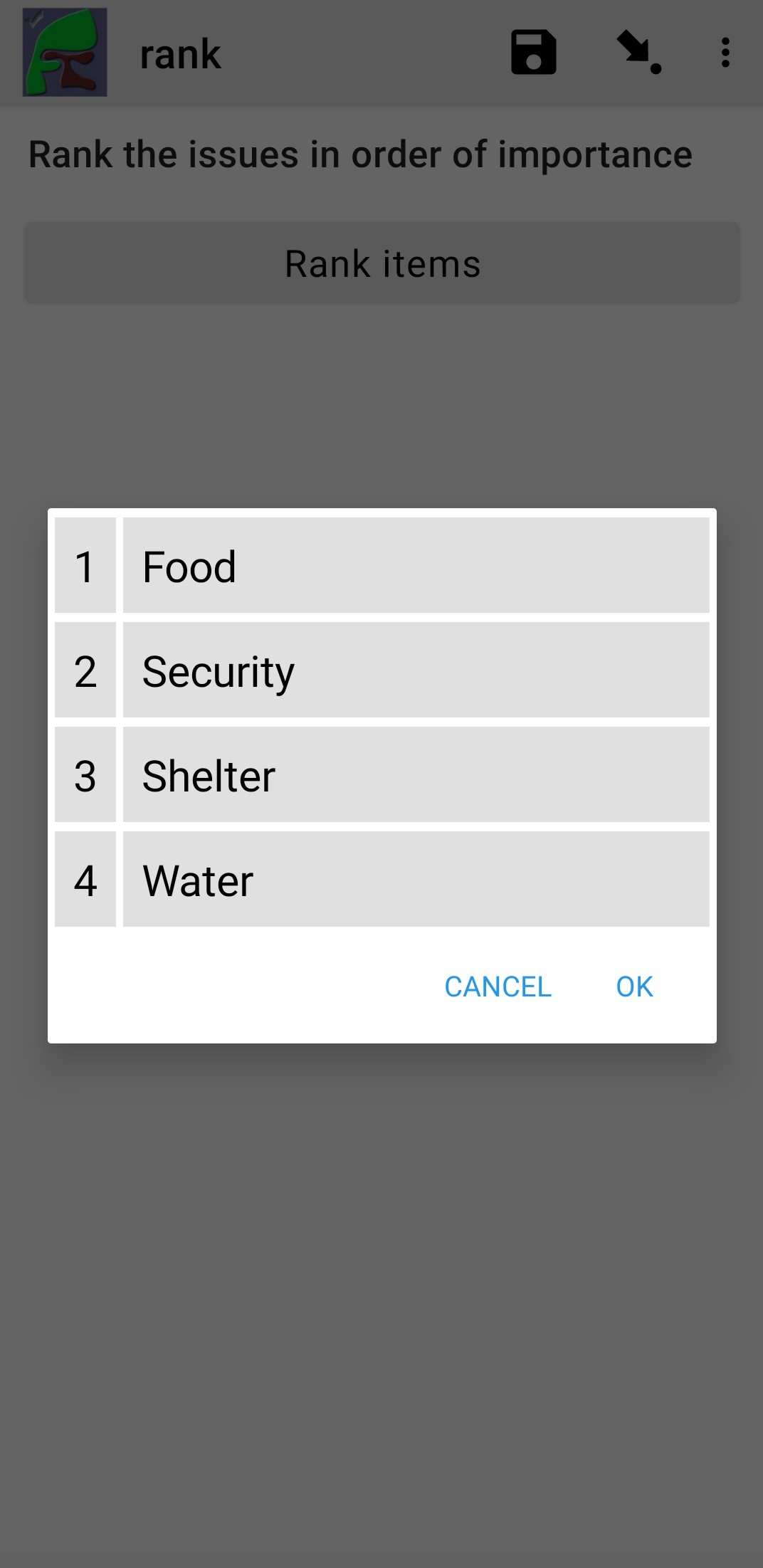
rank widget after re-ordering
Viewing Recorded Rankings
When results are exported in the default spreadsheet format they will be shown in multiple columns. One for each choice. The column headings will be taken from the question name with the addition of "1", "2", "3" etc. The first column will contain the choice that was ranked first and so on.
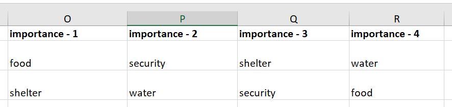
Spreadsheet report of rankings
In other views of the collected data, such as in the console, the rankings will be shown in compressed format where they are all placed in a single column, in rank order, with a space between each value.
Getting choices from a repeat
Requires Smap Server version 21.04
If you have collected data using a repeat then you can generate a follow-up select question using values from this repeat. Types supported:
select_one
select_multiple
After specifying the type add the question name that you want to use to create the select list. This is placed where you would normally put the list name.
If you want to filter the choices then put the filter criteria into the choice_filter column.
type |
name |
label |
choice_filter |
|---|---|---|---|
begin repeat members |
Member |
||
text |
name |
Person's name |
|
integer |
age |
Person's age |
|
end repeat members |
|||
select_one ${name} |
oldest |
Select the oldest person |
|
select_one ${name} |
oldest_child |
Select the oldest child |
${age} < 18 |
image
Taking a Picture
- Type
image
Captures an image either using the camera or by selecting from the device gallery.
type |
name |
label |
|---|---|---|
image |
picture_of_tree |
Take a picture of the tree |
image with annotation
Draw on an image after it has been captured. An additional button labelled "Markup Image" is shown that is enabled after the image is captured.
- Type
image
- Appearance:
annotate
type |
name |
label |
|---|---|---|
image |
damage |
Take a photo and circle the damage |
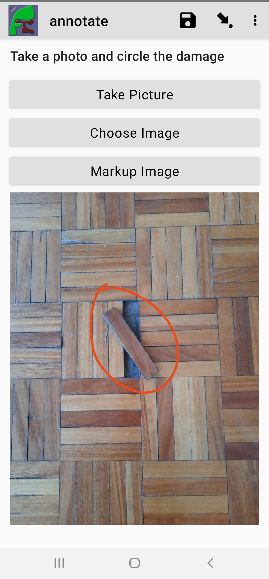
Annotate Type
image as a drawing
- Type
image
- Appearance:
draw
This is similar to annotate except the user draws on a blank canvas.
type |
name |
label |
appearance |
|---|---|---|---|
image |
draw_farm_layout |
Draw a plan of the farm |
image as a signature
- Type
image
- Appearance:
signature
Allows the user to draw a signature of their name.
type |
name |
label |
appearance |
|---|---|---|---|
image |
hh_signature |
Ask householder to sign the screen |
signature |
Other Image appearances and parameters
Require a new image
The default behaviour is to include a button that allows the user to select an existing image rather than taking a new one. However by adding the appearance "new" the user is required to capture a new image.
Self portrait (selfie) image
The back camera on the phone is used by default (although the user can change this). However by setting the appearance "new-front" the front camera is used by default to capture a selfie.
Note
selfie can also be used as the appearance so that the front camera is opened by default.
Reducing the size of images
The size can be reduced by specifying the maximum length of the longest side of the image using max-pixels. For example if the default picture size is 1,000 by 500 and you specify the max-pixels to be 200, then the image will be resized to 200 by 100 pixels.
In the parameters column add max-pixels= followed by the maximum length of the long edge in pixels.
Note
The proportions of the image are maintained and if the length of the longest side was less than max-pixels the image will not be changed.
Automatically opening the camera
Add the parameter auto=true to an image widget to automatically start the camera. This requires the appearance of new to also be set so that the camera is the only tool that can be opened and the image gallery will not be opened.
Acknowledge / Trigger
- Type
trigger or acknowledge
You can use a type of either trigger or acknowledge, they work the same way. A single checkbox is shown which the user can "acknowledge" by checking it. If they do this then the answer stored for the question is "OK".
You can use the above answer in relevance for following questions. For example:
${ack} = 'OK'
Commonly, select_one questions with yes/no choices are used instead of acknowledge.
type |
name |
label |
relevance |
|---|---|---|---|
acknowledge |
ack |
Select to confirm participation |
|
text |
name |
What is your name? |
${ack} = 'OK' |
Acknowledge widget in fieldTask
In Web Forms a radio button is used instead of a checkbox.
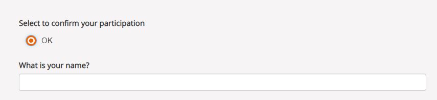
Acknowledge widget in WebForms
Printer widget
- Type
text
- Required appearance
Connects to an external label printer, and prints labels that can contain a barcode, a QR code, or text.
type |
name |
label |
appearance |
calculation |
|---|---|---|---|---|
text |
printer_widget |
Printer widget |
concat('123456789','<br>','QR CODE','<br>','Text') |
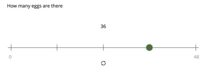
range
These widgets allow the user to select a numeric value within a range of numbers shown on a line.
- Type
range
Parameters
start: The starting number end: The last number step: The increment between numbers
Range widget with integers
If all three parameter values are integers then input will also be stored as an integer.
type |
name |
label |
parameters |
|
|---|---|---|---|---|
range |
eggs |
number_of_eggs |
How many eggs are there? |
start=0;end=48;step=12 |
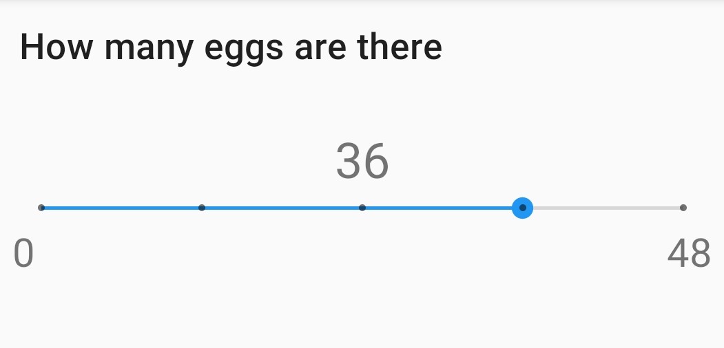
Integer Range widget in fieldTask
Integer Range widget in Web Forms
Range widget with decimals
If one or more of the 3 parameters (start, end, step) are decimal then the answer will also be recorded as a decimal value.
Vertical range widget
- Appearance
vertical
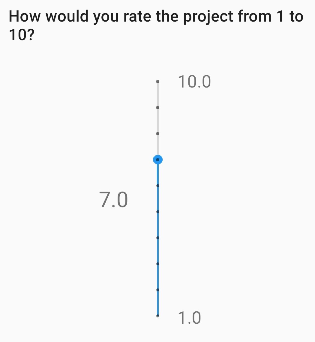
Vertical Range widget in fieldTask
Vertical Range widget in Web Forms
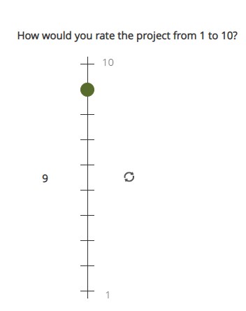
Range widget with picker
- Appearance
picker
Availability:
FieldTask: yes
Web Forms: no
When picker is added as an appearance the answer can be selected from a spinner rather than by clicking at a point on a line.

Vertical Range widget in WebForms
Range widget with rating
- Appearance
rating
When rating is specified as the appearance then the range is shown as stars which the user can select. The number of stars is equal to the value of the end parameter. The start and step parameters are ignored. Hence the value set is equal to the number of stars selected counting from the left.
type |
name |
label |
appearance |
parameters |
|---|---|---|---|---|
range |
rating |
Rate your experience |
rating |
end=5 |

Rating Range widget in fieldTask
Chart
- Type
chart
Shows a chart in the survey. Chart settings are specified in the question parameters. More details are available in Charts
Availability:
FieldTask: yes
Web Forms: no
Child Form / Parent Form
- Type
child_form, parent_form
Launches another survey from within the current survey. The difference between these is in how the data from the two surveys are linked in the results database. If you don't care about linking the data between the two surveys then either type will do. Detailed information on using these question types is available in Launch a Survey from inside a Survey.
Availability:
FieldTask: yes
Web Forms: no
Locations
Location widgets capture one or more points as latitude, longitude, altitude in meters, and accuracy radius in meters. These data items are space-separated. For example the following reading represents a latitude of -18.27, a longitude of 27.32, an altitude of 25 meters and an accuracy of 5.6 meters: -18.27 27.32 25 5.6
Multiple points that form lines or shapes are separated by semicolons.
Availability:
FieldTask: yes
Web Forms: yes
Multiple Locations in one Form
Prior to Smap server version 20.10 you could only put one location widget in each form of a survey. The reasoning behind this was that in GIS shape files the same restriction applies where each shape file consists of a single location and all the attributes associated with that location. Also the name of each location question was automatically set to "the_geom". I'm afraid to say this was just done to make the coding easier!
In version 20.10 this restriction has been lifted:
You can add multiple location questions in any form as well as the location preload in the top level form.
Location questions keep the name that you give them.
When you export a survey as a shape file you can select the location to use. All other questions are assumed to be attributes of that location.
When viewing a map of a survey on the analysis page you can select the question to use as the location.
When creating a task from existing data the location of the task is determined automatically. Firstly it tries to get the first geopoint question in the source survey. If that does not exist it tries to use the location preload that might have been collected automatically. If that is not set then it will use the first geotrace or geoshape question that it finds.
The map in the console currently uses the first location it finds in the survey. This will be fixed in a later release.
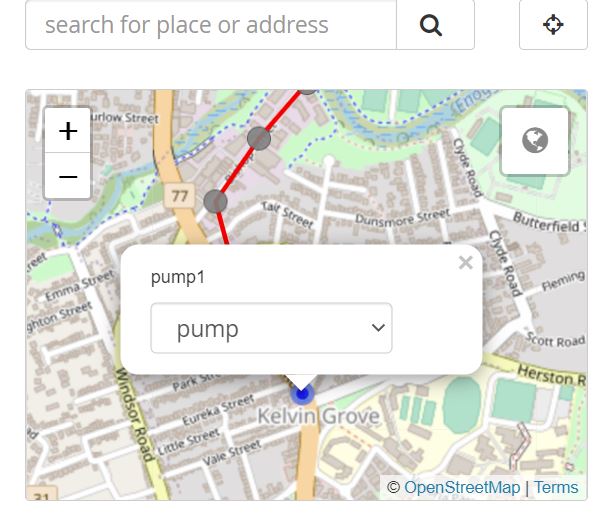
Warning
You may have an existing survey that you created using a spreadsheet and perhaps you have a geopoint question in that survey which you called "pump_location". Once your server is updated to 20.10 and you use the "replace" button to update the existing survey then a new column will be created in the database called "pump_location" to hold that location data. However any previously collected data will be stored in a column called "the_geom" and will no longer be accessible. You will see a warning in red if this happens when you do the replace.
In this circumstance, if you still need to access the old location data, edit your survey in Excel and change the name of the geopoint to "the_geom". Then replace the survey so you can redo the replace action.
geopoint
Records a single point.
- Type
geopoint
Appearance:
maps
placement-map
history-map
The appearance maps will show a background map to give context when the user records their location.
The appearance placement-map will allow the user to click on the map to record a location which does not need to be where the user is standing.
The appearance history-map can be used on geopoint questions inside a repeat. Previous geopoint values added for that question will then be shown in the background for context. Requires FieldTask 6.703 or above.
type |
name |
label |
|---|---|---|
geopoint |
the_geom |
Record Location |
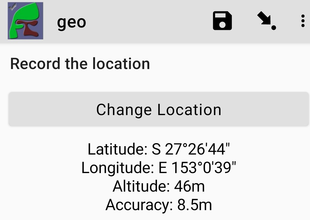
Results after requesting a geopoint
geotrace
Records a line
- Type
geotrace
- Appearance
history-map
The appearance history-map can be used on geotrace questions inside a repeat. Previous geotrace values added for that question will then be shown in the background for context. Requires FieldTask 6.703 or above.
geoshape
Records a shape.
- Type
geoshape
- Appearance
history-map
The appearance history-map can be used on geoshape questions inside a repeat. Previous geoshape values added for that question will then be shown in the background for context. Requires FieldTask 6.703 or above.
geocompound
Similar to geotrace this type records a line, however attributes can also be added to points along the line. To set a marker on a line click on the point and a pop-up will be shown.
- Type
geocompound
- Appearance
marker:{type}:{name}:{label}
Availability:
FieldTask: no
Web Forms: yes
XLSForm: yes
Online Editor: yes
Geocompound Widget
Requires version 22.02 of the server.
Use of the marker appearance requires version 22.07 of the server. Multiple marker types can be specified.
type: must be either pit or fault. When a Compound PDF Image is drawn the line end points use the locations of pits.
name: The name that will be shown in the drop-down list allowing a marker to be associated with a point (no spaces)
label: The stem of the marker label, an index will be added for each occurrence of a marker type, for example JC1, JC2 etc. (no spaces).
type |
name |
label |
appearance |
|---|---|---|---|
geocompound |
pipeline_faults |
location of faults |
marker:pit:Pump:pump marker:fault:Defect:defect |
The street addresses of markers can be automatically recorded in other questions that have the same name as a label. For example if a label is specified as JC then the address of the first marker of that type will be stored in a question called JC1 and so on. Note only questions in the top-level of a form will be updated with a marker address.
Matrix
The begin matrix type is a convenient way to show questions in a matrix structure using webforms.
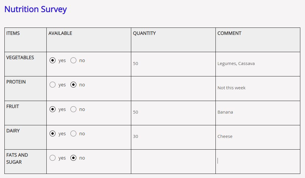
Matrix Widget
To create the matrix, group the questions that will appear horizontally, however instead of using begin group/end group use begin matrix/end matrix. Because these questions are appearing horizontally there will be a limit to how many you can fit on the screen comfortably.
Then specify the rows of the matrix in a choice list in the choices worksheet. Put the name of the choice list used by the matrix in the "list name" column of the survey worksheet. As these choices create the rows of the matrix you can add as many as you like and the matrix will simply extend down the page.
Finally in the settings sheet, under "style" add "theme-grid".
When you load the survey onto the server additional questions will be created in groups. One group for each of the choices and a group for the header. Hence the matrix type is not a real type as it is converted into multiple other questions on upload.
- Type
begin matrix, end matrix
Example
type |
name |
label |
list name |
|---|---|---|---|
begin matrix |
nutrition |
items |
food_groups |
select_one yn |
available |
Available |
|
integer |
quantity |
Quantity |
|
text |
comment |
Comment |
|
end matrix |
list_name |
name |
label |
|---|---|---|
food_groups |
vegetables |
Vegetables |
food_groups |
protein |
Protein |
food_groups |
fruit |
Fruit |
food_groups |
dairy |
Dairy |
food_groups |
sugar |
Fats and sugar |
yn |
yes |
yes |
yn |
no |
no |
Availability:
FieldTask: no
Webforms: yes
XLSForm: yes
Online Editor: no
Literacy Test
- Type
select_multiple
Appearance:
literacy
body::kb:flash
Set to the interval between the Start button being pressed and the screen flashing to indicate that reading progress (word reached) should be recorded.
The words to be read are listed in the choices worksheet.
XLSForm
type |
name |
label |
body::kb:flash |
|---|---|---|---|
select_multiple word_list |
literacy_question |
Assess literacy proficiency |
30 |
Availability:
FieldTask: no
Webforms: yes
XLSForm: yes
Online Editor: no
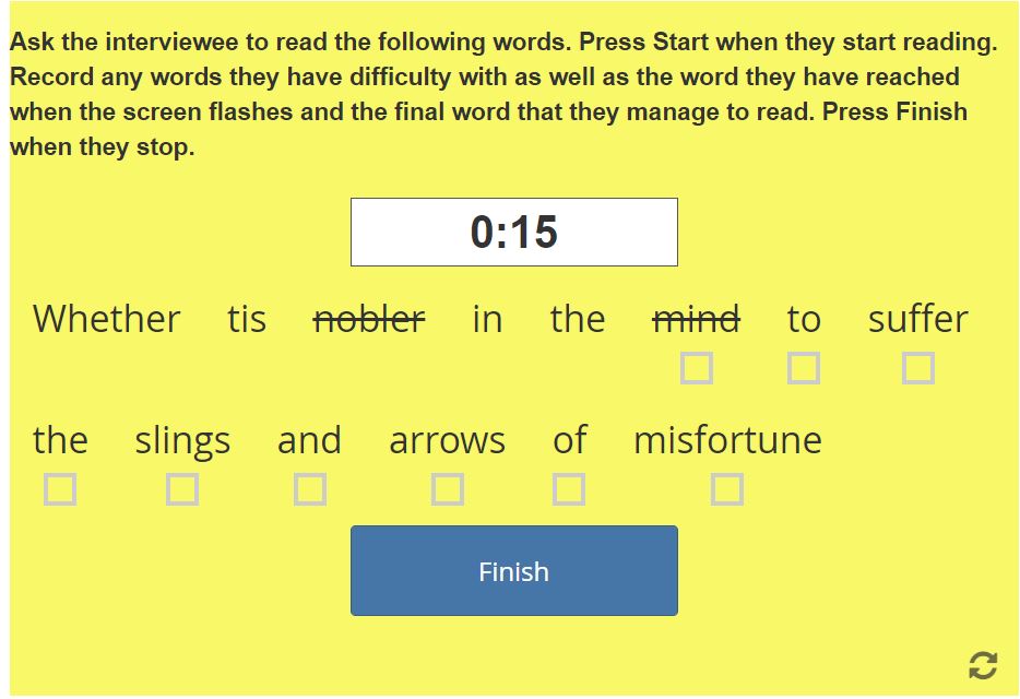
Literacy widget after the flash and before the user marks progress made at point flash occurred
When the widget is first shown it appears with a list of the words to be read and a Start button. It is assumed that the interviewee has a list of the words to be read as well and the enumerator will be recording their reading performance in Web Forms.
After the enumerator presses the Start button, the timer is started. This will cause the screen to flash after the specified number of seconds or 60 seconds if no number is specified in body::kb:flash. During this period the enumerator can select words that the reader finds difficult.
After the screen flashes the enumerator will be able to select the word that the reader had reached. They can then continue to select words that the reader is having trouble with.
After starting a Finish button is shown. When the enumerator presses Finish the timer stops. They can then record the final word read.
Viewing Literacy Results
When you view the output in the console it appears in its raw format. That is a number of values separated by spaces including:
The index of the word being read when the screen flashed
The time in seconds elapsed before the Finish button is pressed
The index of the word being read when the Finish button was pressed
The text "null null null null null null null"
A space-separated list of the words that were marked as being wrong or difficult for the reader.
Support for literacy widgets has been added to the default Excel export from the analysis page. This formats the output to make it easier to analyse. Four additional columns are automatically added to the export for each literacy widget. These record:
The total time elapsed between pressing Start and Finish
The index of the word being read when the screen flashed
The index of the word being read when the Finish button was pressed
The count of words that were marked as being difficult or in error
The recording of which words the reader had trouble with then behaves like any other select question. If you specify "Compress select multiples" for the export then they will be shown as a comma separated list of choice values. Otherwise a column in the export will be added for each word choice and the value will be set to "1" if the word was a problem or "0" if it was not. This allows you to easily add up the number of times each word was marked as a problem.
Audio
Default audio widget
- Type
audio
Records audio using the device's microphone or a connected external microphone. This default audio widget uses an external audio recording application. Most Android devices come pre-installed with one however you can also install an application from the Play Store.
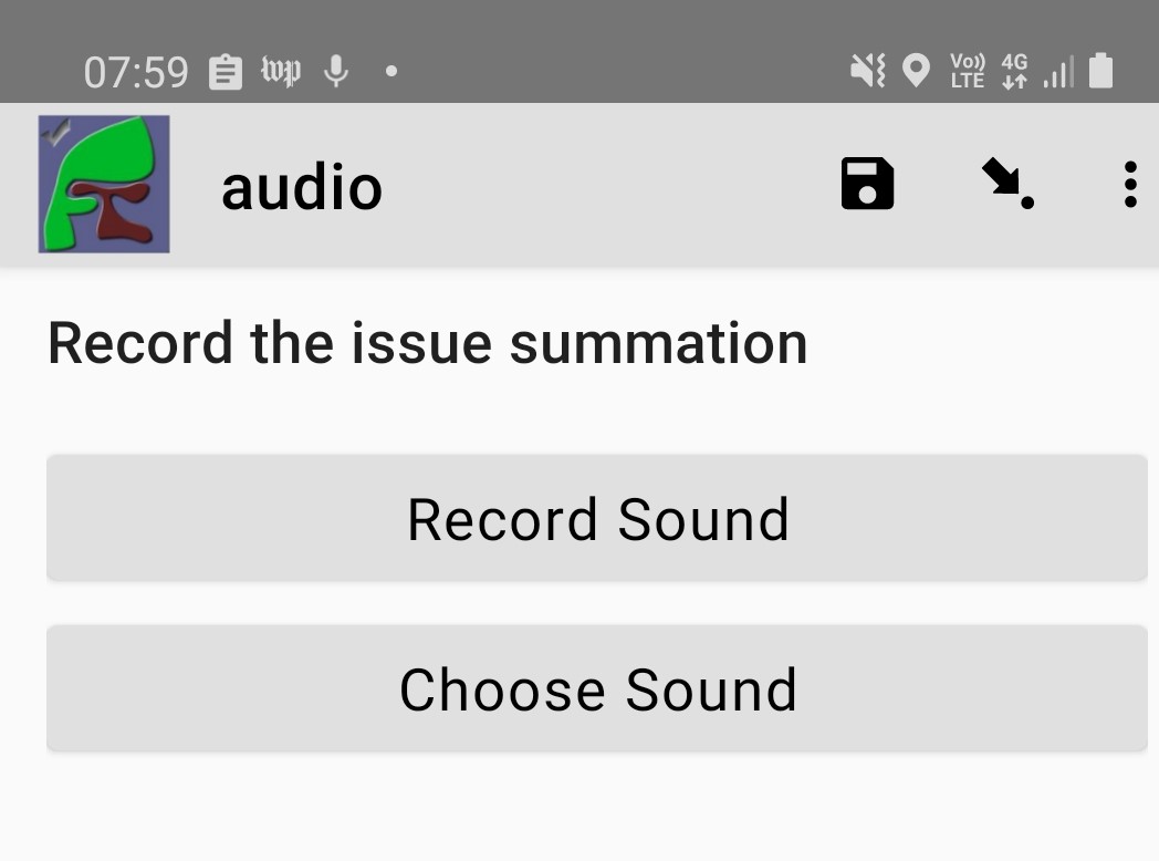
Question using the default audio widget
XLSForm
type |
name |
label |
|---|---|---|
audio |
summation |
Record the issue summation |
Using the built-in audio recorder
- Type
audio
Parameters:
quality: Refer to Audio quality
Added in FieldTask version 6.300
The built-in audio recorder makes it possible to record audio while filling out other questions and will continue recording even if the user switches to another app or if the phone screen is locked. To use the built-in audio recorder specify the audio quality for the audio question.

Question using the built-in audio recorder
When built-in audio recording is enabled and recording is initiated, a recording control bar appears at the top of the screen. If the pause button is tapped, recording is temporarily suspended and the button icon changes to a microphone. When the microphone is tapped, recording is resumed. After the stop button is tapped, the recording is ended and can no longer be modified.
Tip
Short audio files can be quite small compared to video and high resolution images however a long recording can become large. If this is likely to be an issue then you can consider changing your audio quality settings.
Android devices can make many sounds during use and these will be included in recordings. We recommend turning off sounds from button presses, camera shutters and notifications before recording.
Other questions can be included on the same screen as a built-in recording question. This makes it possible to answer other questions while recording. To do this, put the questions in a group that has an appearance of field-list.
During recording, the user is prevented from leaving the current question screen. However, you can use other applications or lock the device screen.
To replace the audio captured, first delete the current file and then record again.
In some rare cases such as the device running out of space, the recording may complete successfully but not be attached to the form. If this happens, a dialog will be displayed explaining that the file is available but needs to be accessed manually. You can find these files in the recordings folder of the FieldTask directory. This folder is never cleared so you should delete these files once you have retrieved them.
Audio quality
The quality of audio recordings can be customized using the quality parameter. If a quality is specified, then the built-in recorder is used unless the quality is set to external. If no quality is specified then the internal audio recorder is used by default.
Value |
Extension |
|---|---|
normal |
.m4a |
low |
.m4a |
voice-only |
.amr |
Tip
We recommend always using low or normal unless you have very tight bandwidth concerns. These two quality settings produce audio that can be transcribed using Smap's powerful transcription capability.
XLSForm
In the parameters column, enter quality= followed by the desired quality. The online editor also supports setting the quality for audio questions.
type |
name |
label |
parameters |
|---|---|---|---|
audio |
interview |
Start the recording before commencing the interview |
quality=low |
Getting audio from a custom external app
- Type
audio
Appearance:
ex: followed by the identifier of the application that you want to launch
Added in FieldTask version 6.300
Note
This external app can be different from the external application that is launched by default to record audio. You can specify exactly the application that you want rather than any application that responds to a request to record some audio.
See also
XLSForm
type |
name |
label |
appearance |
|---|---|---|---|
audio |
some_audio |
Specific External Audio |
ex:com.example.getaudio |
Background Audio
If you want to automatically record audio while the survey is being completed then you need Meta Items.
Video widgets
Tip
Videos can be large. Be very careful before adding video questions and test that you have enough bandwidth and disk space on the Android devices. You can specify in the settings that only low resolution videos should be taken. This can also be done in the Mobile App Options for the organisation so that it applies to all devices automatically.
Default video widget
- Type
video
Records video, using the device camera.
XLSForm
type |
name |
label |
|---|---|---|
video |
vehicle_traffic |
Please record a video of the traffic |
Front facing camera video
- Type
video
- Appearance
new-front
Records video, using the front-facing camera. The Choose Video button is not displayed.
XLSForm
type |
name |
label |
appearance |
|---|---|---|---|
video |
front-video |
Video yourself reading the question |
new-front |
External app video widget
- Type
video
Appearance:
ex: followed by the identifier of the application that you want to launch
Added in FieldTask version 6.300
See also
XLSForm
type |
name |
label |
appearance |
|---|---|---|---|
video |
some_video |
Specific External Video |
ex:com.example.getvideo |
Files
Warning
Files can contain malware so make sure you use an antivirus scanner before opening any file uploaded to the server.
Default file upload
- Type
file
XLSForm
type |
name |
label |
|---|---|---|
file |
supporting_doc |
Please select the supporting documentation |
External app file widget
- Type
file
Appearance:
ex: followed by the identifier of the application that you want to launch
Added in FieldTask version 6.300
Calls an external application to get a file for upload. You can create your own custom apps to get verified binary files to include in a survey response. .. seealso:: Launching Apps from a Survey
XLSForm
type |
name |
label |
appearance |
|---|---|---|---|
file |
supporting_doc |
Select the test results to include |
ex:com.example.gettestresults |
Server Side Calculations
- Type
server_calculate
These question types can be defined in a survey but they are not used to complete a survey. Instead they can calculate additional derived information when the survey results are analysed or exported from the server.
Compound PDF Map
- Type
pdf_field
Appearance:
pdflinemap, followed by the names of the geopoint questions to include in the compound image.
Added in Smap Server version 21.11
This question type has a specific purpose which is to represent cable segments and the location of faults along that segment. When a PDF is created for a survey that contains it, the geopoint values for the specified questions are combined onto a single map. The appearance contains the names of the geopoints. These are in order:
The location of the start of the cable segment
The location of the end of the cable segment
The location of a fault
The location of another fault etc
Note
This question type is not required to display a map generated from a geocompound question.
XLSForm
type |
name |
label |
appearance |
|---|---|---|---|
pdf_field |
fault_location |
Location of faults |
pdflinemap_p1_p2_f |
In the above example the geopoint question p1 will identify the start of the cable or pipe, p2 the end and f the location of the fault(s).
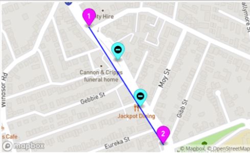
A compound map showing a cable/pipe and faults
Each question name is separated by an underscore "_". If the fault question is in a repeat then multiple faults will be included for each sub form record.
Compound PDF Image
- Type
pdf_field
Appearance:
pdflineimage, followed by the name of a geocompound question or the names of the geopoint questions to include in the compound image.
pdftl, followed by questions that set traffic light colors
pdflinelocation followed by the marker type and index that you want the location on
Added in Smap Server version 21.11
Just like the compound map this question represents cable segments and the location of faults along that segment. The representation is just a little more abstract than the map. However traffic light indicators can also be added to the output.
XLSForm
type |
name |
label |
appearance |
|---|---|---|---|
pdf_field |
marker_image |
Image of markers |
pdflineimage_c1 |
pdf_field |
marker_image |
Image of markers |
pdflineimage_p1_p2_f |
pdf_field |
pit_location |
Location of pit 2 |
pdflinelocation_c1_pit_2 |
In the first example above the locations of the cable endpoints and the faults will be in a geocompound question called "c1". In the second example the geopoint question p1 will identify the start of the cable or pipe, p2 the end and f the location of the fault(s). There will be multiple faults if "f" is in a repeat. In the third example the GPS coordinates of the second pit in the geocompound question c1 will be displayed.
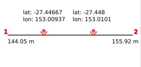
A compound image showing a cable/pipe and faults
Traffic Lights
Multiple appearances starting with pdftl can be used to add traffic lights to the image.
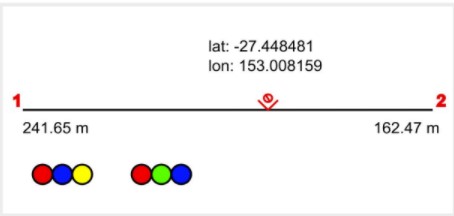
A compound image annotated with traffic light indicators
Colors are set by the answers to questions. Usually a calculate question could be used to generate the color. For example a question may have one of the following values:
red
orange
yellow
green
white
black
#af04b1
Custom RGB values need to be preceded by a hash (#). Examples:
pdftl_q1_q2   creates a traffic light with two colors
pdftl_high_medium_low    creates a traffic light with three colors
Optionally annotations can be added to the traffic lights. These annotations are an X, that is a cross through the light and a label that appears under the light. These annotations are added by adding a colon after the question identifying the light's color. Then either the letter x or the letter l followed by the name of the question that determines whether or not the light is crossed out and/ or its label:
pdftl_q1:xq3:lq4_q2
pdftl_q1:xq3_q2:lq4
pdftl_q1:xq3:lq4_q2:lq4:xq5
To cross out a traffic light the value of the referenced question will need to be "yes" or "true" or "1".